02 Structure
The Retail site
An 8-section sitemap for consumers: products, where to buy and recipes, with the key features of each page.
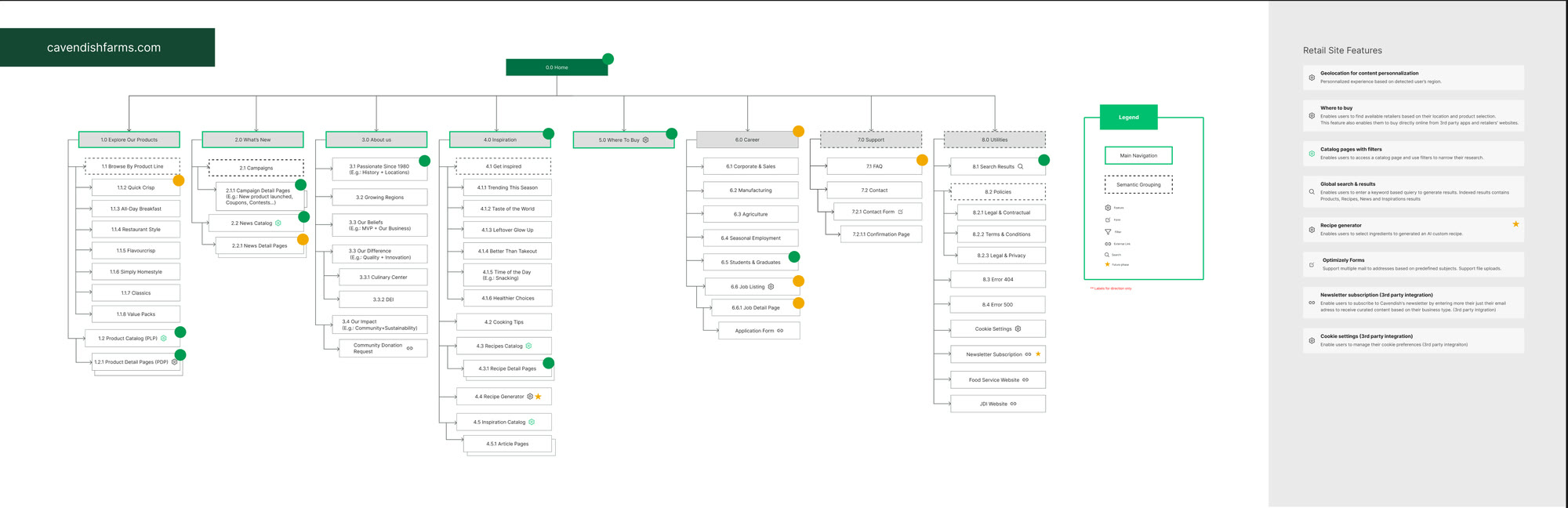
Two sites, two audiences: help consumers discover the products, and give foodservice professionals all the practical information they need.
Present the same products to two audiences who do not expect the same thing from them: a meal idea on one side, a spec sheet on the other.
sites redesigned: Retail for consumers, Foodservice for professionals
pages designed as wireframes, desktop and mobile
high-fidelity mockups that bring the new brand to life
Cavendish Farms wanted a modern web experience to support its omnichannel expansion. The work involved redesigning two sites while laying the groundwork for a scalable platform for the next phases.
Cavendish serves two very different audiences, with a site for each. The Retail site, cavendishfarms.com, is for consumers: it presents the product range, shows where to buy it, for example at Metro, IGA or Maxi, and offers recipes to make with these products.
The Foodservice site, foodservice.cavendishfarms.com, is for professionals: restaurant owners, cafeterias and food services. It provides the B2B information they need every day: bag formats, storage, shelf life and cooking methods.
The project covered the full process: benchmark, information architecture redesign, user journey definition, wireframes, then the first high-fidelity mockups based on the new brand identity.
8 sections
10 sections
Five goals guided the redesign, from architecture to art direction.
Discovery and purchase on the Retail side, detailed information on the Foodservice side.
Present each product clearly and show where to buy it.
Find the right product, then know how to store it, how long it keeps and how to cook it.
Offer recipes built around the products, to spark ideas and make people want to buy.
A strong, consistent art direction across both sites.
Consumers want to learn about the products, find a recipe idea and know which grocery store carries them. Professionals want precise answers: which format, how to store it, how long it keeps, how to cook it.
How do you serve both mindsets on a shared foundation, without weighing down the experience?
Present each product clearly, suggest recipes that use it and point people to the grocery stores that carry it.
Make formats, storage, shelf life and cooking methods easy to access, then help users find a distributor.
Build both sites on the same foundation, without forcing one audience's needs on the other.
A benchmark of industry sites to identify best practices: product presentation, decision-support tools and professional user journeys.
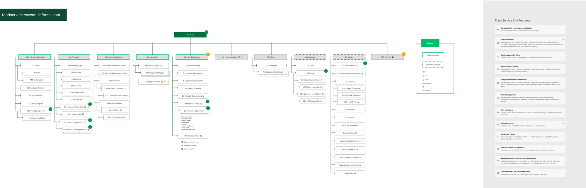
Two separate sitemaps: 8 sections for Retail, 10 for Foodservice.
Three-stage user journeys: discover the brand, choose a product, then come back for recipes, resources and offers.
Desktop and mobile wireframes, starting with navigation, the catalogue and the product page.
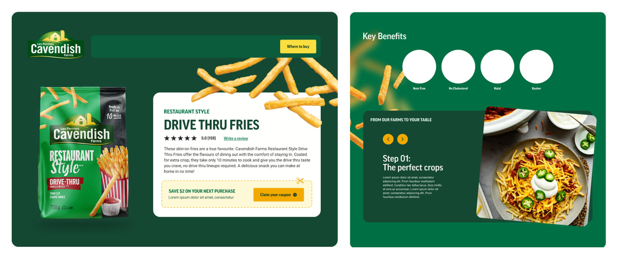
A deep green, a bright yellow for actions, condensed typography and products front and centre.
An 8-section sitemap for consumers: products, where to buy and recipes, with the key features of each page.
A 10-section sitemap designed for foodservice professionals: products, solutions, tools and resources, and a distributor finder.
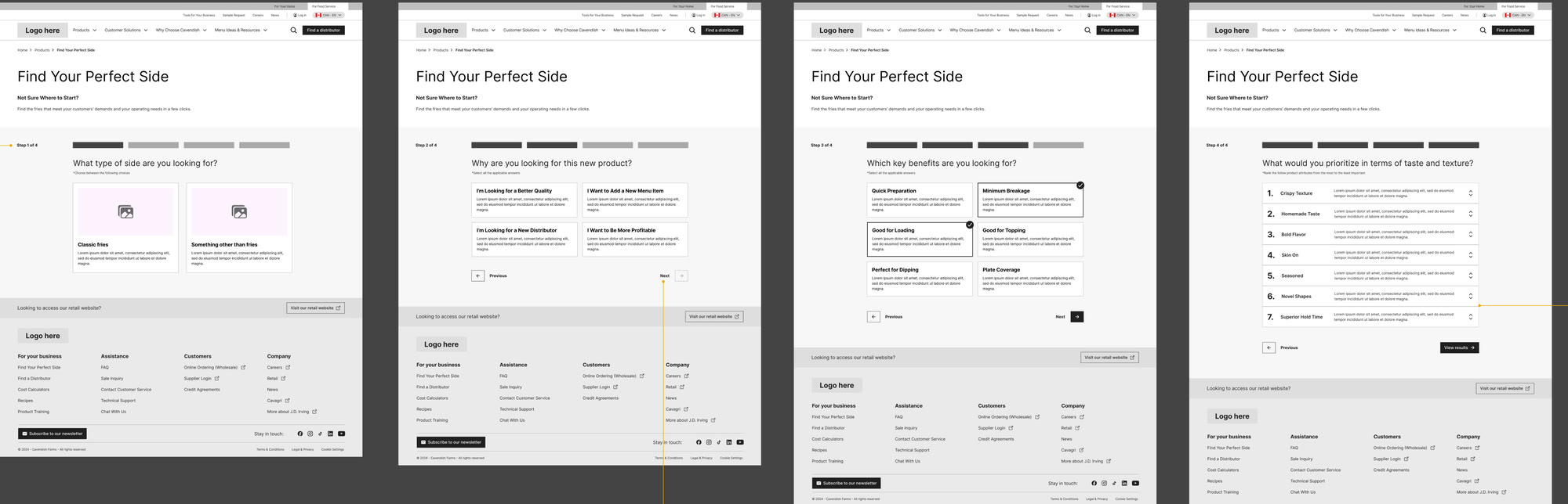
“Find Your Perfect Side” helps professionals find the right product in 4 steps: type of side dish, reason for the choice, desired benefits, and taste and texture priorities.
A deep green, a bright yellow for actions, condensed typography and products front and centre, applied to the key templates.
Navigation, the catalogue and the product page were designed first, because they are reused everywhere. The home page came last, once all the content was defined.
One shared base for both sites: on the Retail side, where to buy and recipes; on the Foodservice side, formats, storage, shelf life and cooking methods.
On the Retail side, a tool to find the grocery stores that sell each product.
Recipes linked to products, to go from a meal idea to the product to buy.
“Find Your Perfect Side” helps professionals find the right product in 4 steps.
Filters by cut, format or benefit, and side-by-side product comparison on the Foodservice side.
Each site has its own structure, but links help visitors who land in the wrong place find the right site.
I was involved at every stage, from analyzing the digital ecosystem to the first mockups.
Strategic benchmark and analysis of the digital ecosystem.
Information architecture redesign and creation of both sitemaps.
Definition of user journeys.
Desktop and mobile wireframes for both sites.
Adapting the new brand for the web and creating the first high-fidelity mockups.
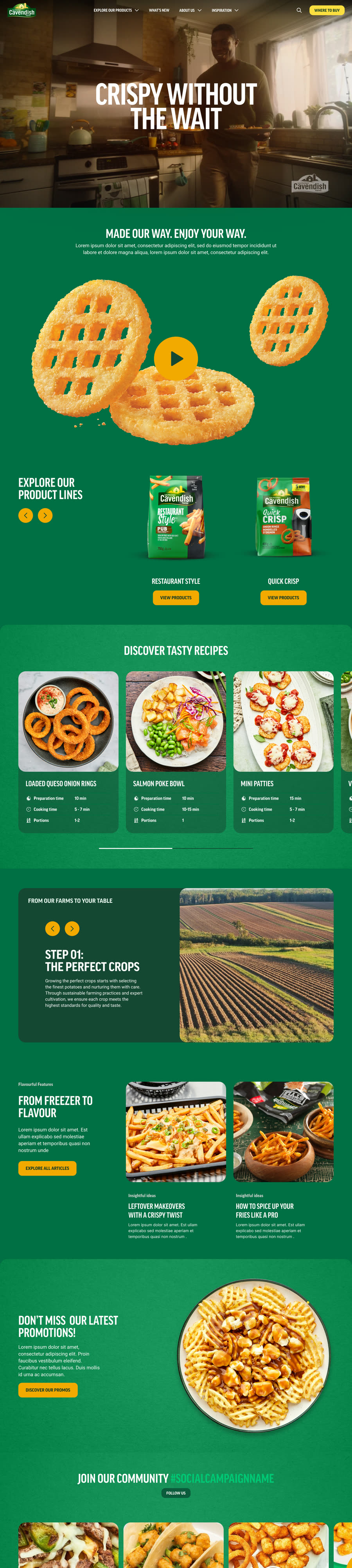
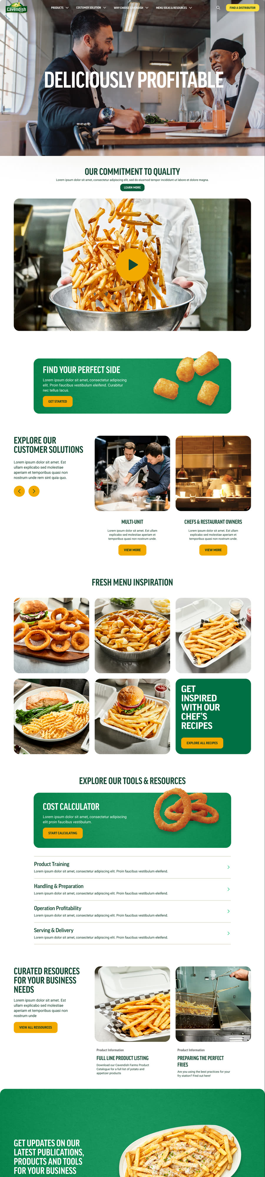
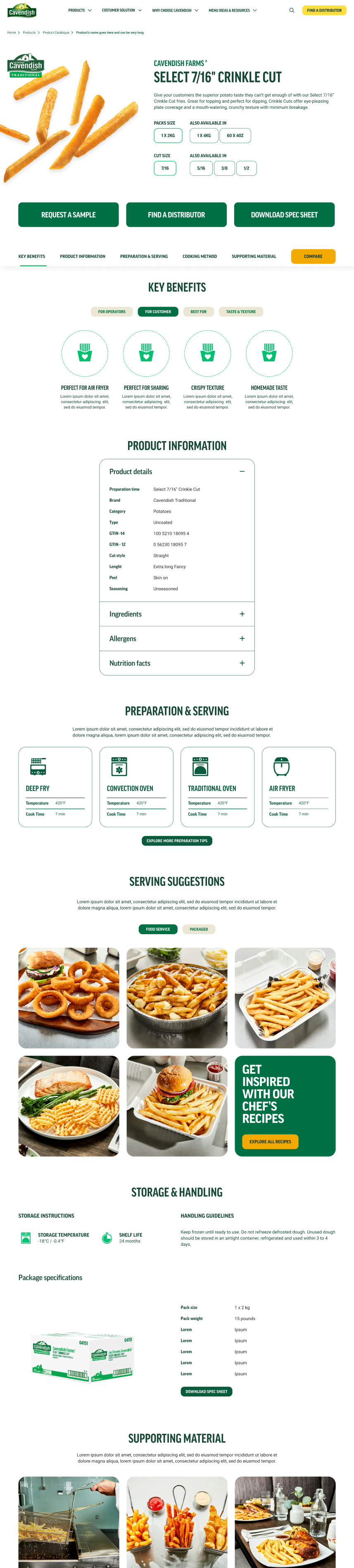
I laid the foundations for both sites, now in development based on my mockups: one to discover and buy the products, the other to choose, store and cook them in a foodservice setting.
main sections for the consumer site
main sections for the professional site
A structure tailored to each audience, connected by cross-links.
Desktop and mobile wireframes for both sites.
Where to buy and recipes for consumers; formats, shelf life and cooking for professionals.
5 high-fidelity mockups that serve as the basis for the design system.
App, website or SaaS platform: let's start from your real needs to design a useful, consistent experience.
Get in touch