01 Analyze
Mapping to simplify
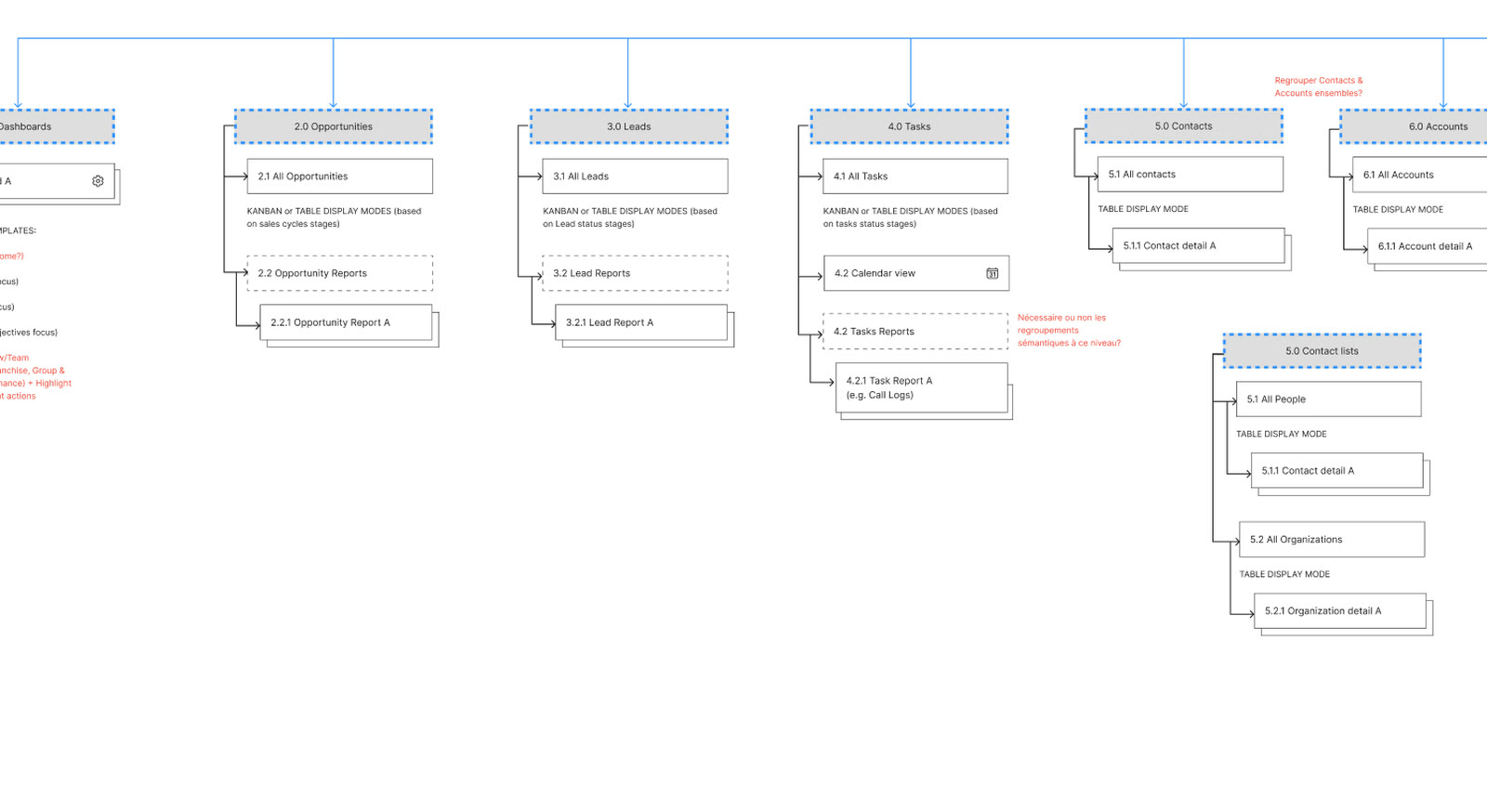
The Boom CRM and Centrix One sitemaps, then a merged architecture: from 15 and 13 sections down to 8-section navigation.
A two-part ecosystem: a clearer desktop CRM born from merging two tools, and a mobile app for salespeople in the field.
Merge two CRMs into a single experience without inheriting their complexity, then extend it into the field.
desktop app that brings together two existing CRMs
apps: mobile for selling in the field, desktop for accessing every detail, from salesperson to manager
key features: AI, voice notes, training videos and gamification
It brings together, in detail, everything that happens in the field, for salespeople at the end of the day, administrative staff and managers.
Cone CRM wanted to launch a new desktop app by bringing together two existing CRMs: Boom CRM, rich in features but with an interface users found hard to understand, and Centrix One, with a modern interface but more limited features.
The challenge went beyond merging two products. The experience had to be rethought to create a unified, more intuitive platform that carried on from the Cone CRM mobile app. In practice, that meant identifying the most used and most valued features, then rethinking them, in both UX and UI, to make them simpler to use.
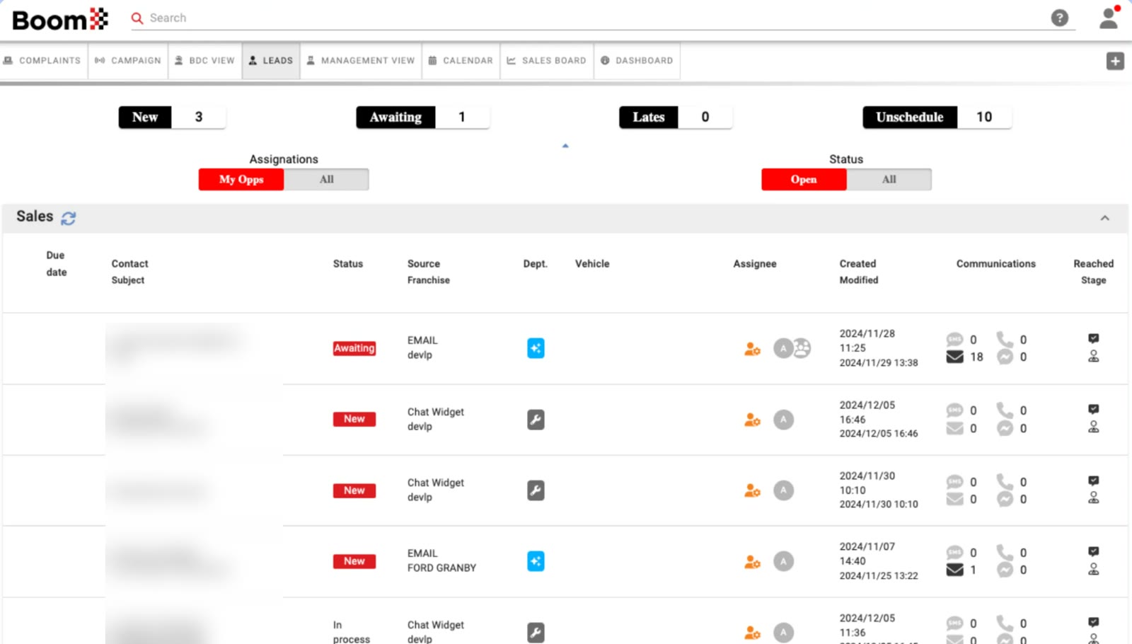
Boom CRM Feature-rich, hard-to-understand interface
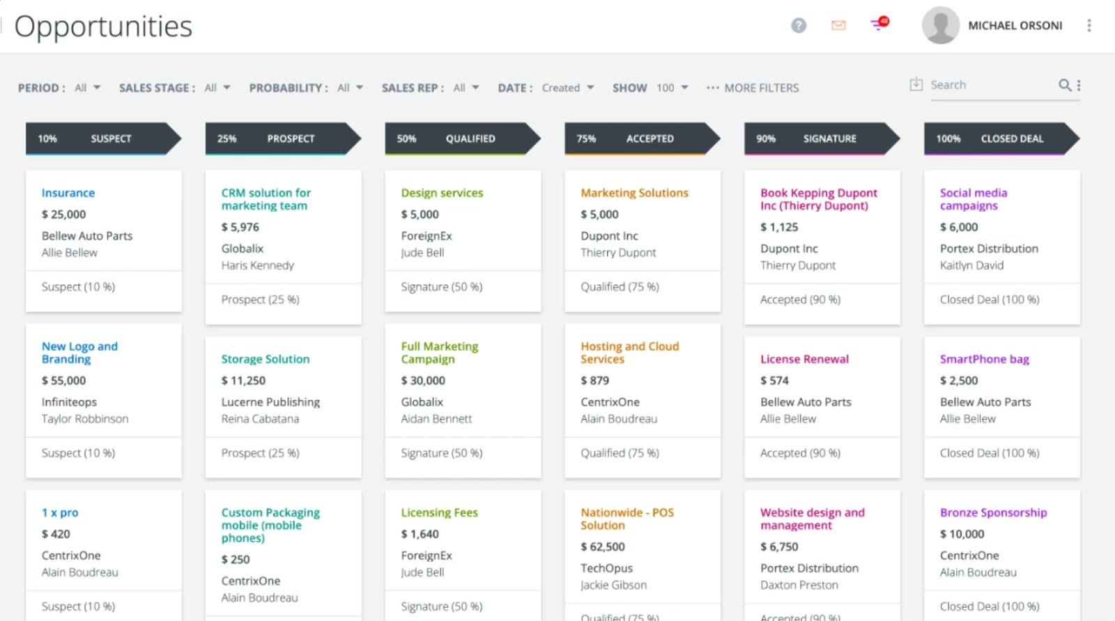
Centrix One Modern interface, limited features
Five goals guided the project, from auditing both products to integrating AI.
Bring the key features of both CRMs together in one consistent experience.
Through a rethought information architecture.
Keep what worked and fix the pain points.
Between the mobile app and the desktop.
At the heart of user flows, rather than as a standalone feature.
Each CRM had its strengths, but also its own structure and its own pain points.
Rich in features, but with an interface that was hard to understand: 8 horizontal tabs, statuses with no view of sales stages and a dense table to read.
A modern interface and a visual 6-stage pipeline, but limited features, filters with no hierarchy and few leads visible at once.
Two different architectures, with 15 and 13 sections, and duplicates to reorganize.
How do you merge two CRMs into a single experience without inheriting their complexity?
Keep Boom CRM's functional depth, with Centrix One's visual clarity.
Decide which features to keep, improve or rethink, and how to organize them.
Make AI a helper at the heart of user flows, not one more module to learn.
Map both CRMs as sitemaps to spot duplicates, gaps in logic and opportunities to simplify.
Interviews with both product teams: for each feature, keep, improve or rethink.
Workshops with the client to prioritize features and define user stories and user flows.
Wireframes to validate structure and interactions, then high-fidelity mockups.
Carry the mobile principles over to a more information-dense desktop.
The Boom CRM and Centrix One sitemaps, then a merged architecture: from 15 and 13 sections down to 8-section navigation.
Defined from the teams' needs, they serve as a reference point for every design decision.
In a workshop with the client, we aligned the sales stages and statuses of both CRMs on a common vocabulary.
NewPendingIn progressWonLost
NewPendingOverdueUnscheduled
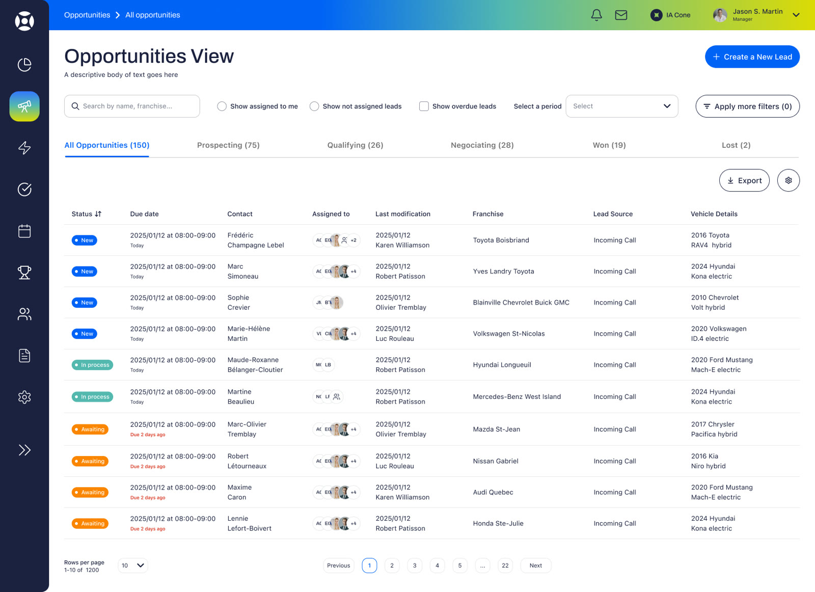
Every choice is explained right on the screen: search, quick filters, sorting, configurable columns and pagination.
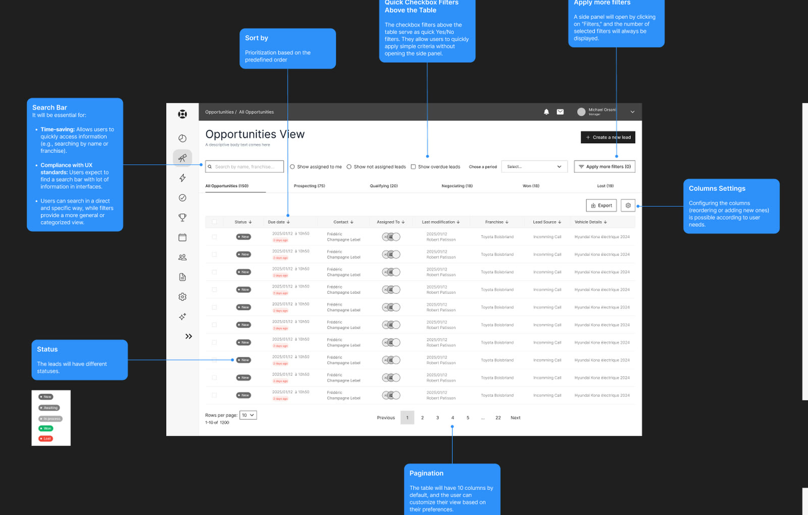
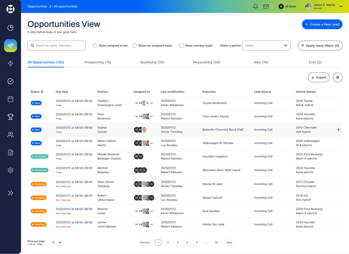
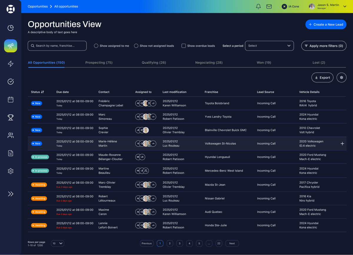
The final opportunities view: tabs by sales stage, colour-coded statuses and filters close at hand.
A palette designed in colour pairs, to keep the same readability in both modes.
I was involved in every stage of the project.
Analysis of both CRMs and their documentation.
Restructuring of the information architecture, in the form of sitemaps.
Definition of user stories, user flows and user journeys.
Co-facilitation of co-design workshops with the client and teams.
Wireframes, high-fidelity mockups and prototypes.
Alignment of the desktop with the branding and patterns of the mobile app.
The CRM is live: office teams work in a single desktop app, and the field team has its own mobile app.
main sections, plus a single settings area and an AI assistant available everywhere
sales stages as tabs, so the pipeline reads at a glance
Each lead appears with its stage, from prospecting to won or lost sale, without opening records one by one.
Statuses are colour-coded and a delay is flagged as soon as it happens.
Integrated right where salespeople work, rather than as a standalone module.
Both apps share the same patterns and the same brand identity.
For dealership salespeople, who follow up on their leads and train between customer meetings.
The desktop CRM brings together, in detail, everything that happens in the field, for salespeople, administrative staff and managers. The mobile app supports the sale on site: it is designed first for salespeople at car dealerships.
Salespeople receive new leads directly in the app and log every action there, such as a visit to see a model, all the way to the sale. The app also trains them, with short videos on sales techniques in a TikTok-inspired format.
The mandate: design an intuitive, engaging mobile experience, with AI and gamification to encourage customer follow-ups and ongoing training.
A co-design workshop to define representative personas: their needs, goals and contexts of use.
A second workshop to map every user action and step in the app.
Identify key features, study the competition and spot friction points to avoid.
User flows, wireframes, UI design and an interactive prototype.
Salespeople work in the field: they don't have time to spend hours in front of a CRM on a computer. They want to move fast, with a simple tool that works the first time.
It shows which follow-ups to do first and generates ready-to-send messages.
Salespeople dictate their notes after a meeting; they sync to the CRM.
TikTok-inspired navigation to discover sales techniques in a few minutes.
Visible goals and progress to encourage follow-ups and ongoing training.
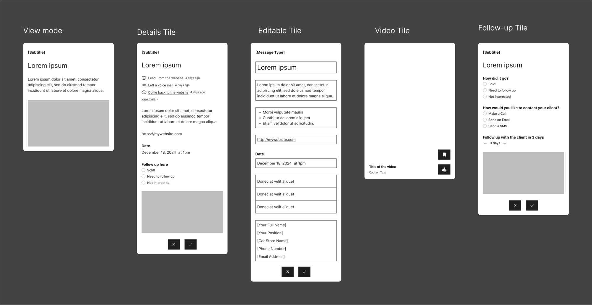
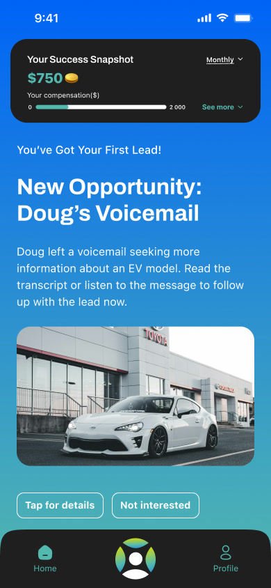
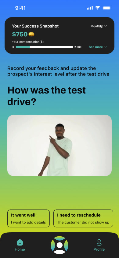
Each new lead arrives as a full-screen tile. The salesperson accepts it, then logs each step, like a test drive, in a single gesture.
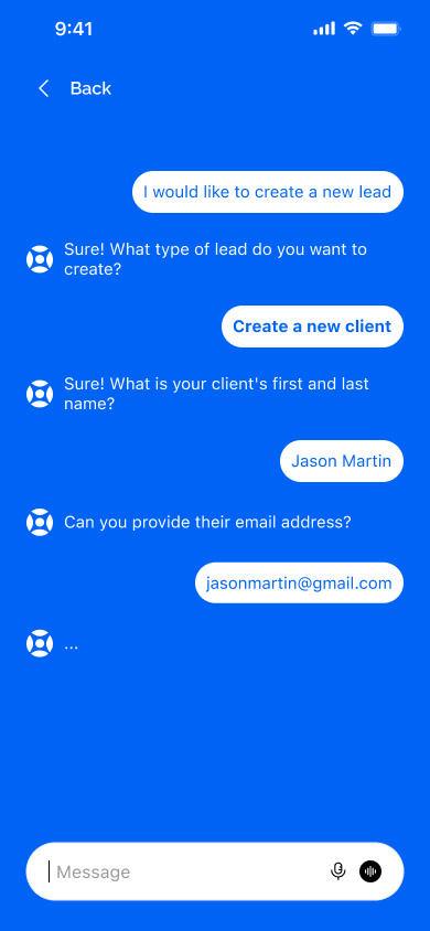
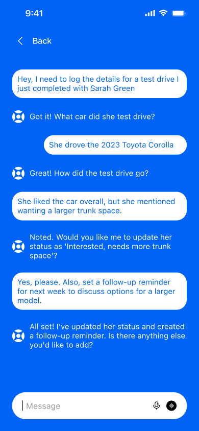
The centre button opens the assistant. The salesperson picks a suggestion, or types or dictates a request: the AI creates the lead, updates the status and schedules the follow-up.
Between customers, the salesperson scrolls through short videos on sales techniques, and likes or saves the ones that help.
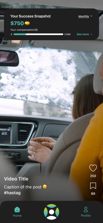
The dashboard shows earnings, ranking, closing rate and completed training. Salespeople set their own goals.
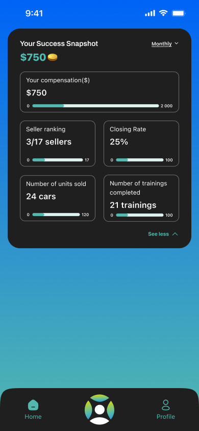
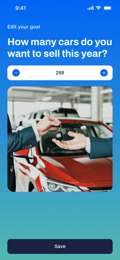
From login to dashboard: receive a lead, reply by email, create a tile with the AI assistant, log a test drive and track goals.
My approach focused on ease of use, relevant features and salesperson engagement, in a context of constant mobility.
UX analysis based on the client's documentation.
Modelling of user journeys, in the form of user flows.
Wireframes, UI design and interactive prototyping.
Adapting features to mobile, based on business goals and technical constraints.
App, website or SaaS platform: let's start from your real needs to design a useful, consistent experience.
Get in touch